Meet Brand-New Tapo 3.0 App

Used Products:

Meet Brand-New Tapo 3.0 App


As a milestone in the development of TP-Link Tapo, we’re excited to introduce you to the new Tapo APP 3.0!

Kasa integration You can now add and control your Kasa devices in the Tapo APP! 

Brand-new UI designs New theme color and Home page optimization are ready for you to experience.


Better-looking  The brand-new UI brings a fresh visual experience


The new theme color was selected to enhance visual comfort. The new status page shows the same color as the light strip.


More ease of use. Optimized features and layout are more user-friendly.


Home Page Optimization

  • Room management Placed on the Home page now; it’s easier to find.
  • Categories integration Devices of the same categories are aggregated together. You can also reorder these categories.
  • Card design Freely switch between list review and grid view.


Status Page Optimization

The layout is optimized with a more reasonable division of functional areas.


More compatible. It supports the management of Kasa devices in the Tapo app.


Binding Add and bind Kasa devices in the Tapo app.

Control Check and control Kasa devices on the Home page of the Tapo app.

Interconnectivity Easily synchronize Kasa devices to Tapo App through quick authorization.


FAQ General questions about linking Kasa devices to Tapo App


What else does Tapo 3.0 bring to Kasa users?

Multiview (camera)

Simultaneous monitoring of multiple camera feeds for a comprehensive view.

Home/Away Mode (camera)

Adjusting camera settings to align with your presence at home or when you're away.


Activity Center (camera)

Quick access to all the detection events of all cameras

 Timer

(Kasa Lighting)


What's new for Tapo users?

Android Widget

Device Quick Control, Device Status, Shortcut, Camera, Robot Vacuum

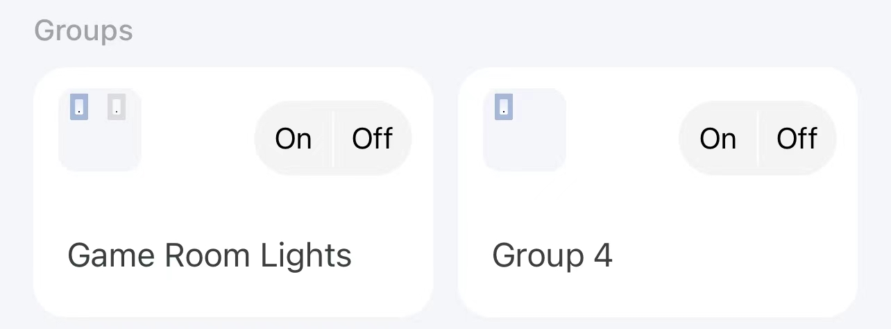
Group Control

Sunrise/Sunset for Smart Action

More Flexible! Sunrise, Sunset, and Sunrise/Sunset Offset are now available as an option for Effective time in Automation

Camera Privacy Mode Quick Control

Activity Center (camera)

Quick access to all the detection events of all cameras


Report a bug or problem? Start a new thread!


Tapo Smart Camera | Kasa Smart Camera

Tapo Smart Plug | Kasa Smart Plug

Tapo Smart Lighting | Kasa Smart Lighting

Tapo Smart Switch | Kasa Smart Switch

Tapo Smart Hubs | Kasa Thermostat

Tapo Smart Sensors

Tapo Robot Vacuums

Feature Request: Tapo | Kasa

Official Annoucements: Tapo | Kasa


Related Articles


Smart Action 2.0: Unlock Next-Level Smart Home Automation

New Tapo APP for Pad Devices -- App Lanscape Mode!

Let's Discuss! What Can You Do with Home Automation?

How To Build A Smart Home (Beginner Guide 101)

What does TP-Link introduce at CES 2024?

Control Smart Device with Deco App < Tapo/Kasa/Philips Hue/Matter >

Landscape Mode - Tapo App for PadShare Your Pet Story. Win Free Tapo Care!Smart Action 2.0 Explore and meet the next level home automation.
77

Comment

@LukeDK If there is still a problem updating your H100 hub, please reproduce the problem, submit feedback in the APP (APP ->Me ->Help & Feedback), and add a debug log for further analysis.

Landscape Mode - Tapo App for PadShare Your Pet Story. Win Free Tapo Care!Smart Action 2.0 Explore and meet the next level home automation.

Hi ,


My tapo camera light blinking orange colour and when am going to check in mobile app device is offline....and not recording anything while blinking orange colour light...

Could you please suggest how to resolve this issue??

image.png


I would like to know as an image attachment where this option is in automation (latest version of app on my iPhone is 2.17.201 and iOS version is 16.5.1, my region is Asia/Bangkok).

From the image, is this an old version app or is there any difference in features from each region ?

References : https://objects.icecat.biz/objects/mmo_95554307_1651665849_5228_27187.pdf

I'm in Spain and my phone language is set to English (UK). The Tapo app displays some smart plugs with the EU socket icon and some with the UK socket icon:


I would like the entire device rectangle to be the button, and a small three-dot icon in the top-right corner to manage/edit the device, like this (this is how it works in Alexa and Google Home):


You can also see from the above screen captures that the device name text is too small. I think this text should be bigger to make it easier to read, and there is no need to display the room name under the device name (Alexa and Google Home only show the device name). doesn't show it. Users can name devices or choose a different icon to help them tell them apart. The advantage is that the saved space could be used to accommodate a larger font for the device name.


Finally, the device widget has some usability issues. Again, the text is too small. It has two tiny on-off buttons but it woud be easier to operate if the whole area of the widget was the switch. This is shown on the right, the "After" mock-up, where "Fan" is powered off and "Speakers" is powered on:


Thanks 

Is this thread supposed to be a place to discuss the Beta version or just a place where beta testers pollute and clutter the thread with pointless comments? Perhaps forum mods could delete messages such as the last 6 messages between my previous comment and this comment, which add nothing to the discussion. You really need to choose your beta testers carefully, I feel a lot of these so-called beta testers are just people who are curious about the beta version but are not here to contribute anything.

I would like to have some options in full screen mode directly available on the screen, one or two taps away. At the moment many options are in the camera settings page and this requires users to first exit full-screen mode, then tap the gear icon, then tap the option:

  • Put the gear icon (camera settings) in the top-right corner of the full-view.
  • Video resolution selector (as a menu, similar to the Day Mode|Night Mode|Auto menu).
  • Enable/disable motion detection with a single tap from the full-screen view.
  • At the bottom-center edge of the full-screen view there is an always-visible caption that shows the page number, for example: < 2/32 > This information is mostly redundant and should only be shown after the user taps the screen, just like the other controls that are normally not shown.
  • The collapsible controls on the right (Snapshot, Capture Video, Hold to talk, Call) don't need to be collapsible. The expand/collapse handle (the one with the arrow) takes up almost as much horizontal screen space as the buttons it collapses, so then what is the point? It would be better if the buttons only showed up after tapping the screen. To hide the buttons again, tap the screen a second time.


In full screen mode, if I only have 2 cameras, why does it show me 32 slots? It would be better if it could just show only the 2 slots that are populated and one empty slot with the bit "+" in the middle to add more


In the camera preview screen (the screen before full-screen mode) I would like to be able to open full-screen by tapping anywhere on the camera preview. At the moment, this requires two taps, first users need to tap the preview to reveal the Full Screen icon, then a second tap on the Full screen icon to view the camera full-screen.


As I mentioned earlier, the call buttons cover the lower 1/4 of the screen in the new version, these buttons need to be smaller and closer to the edge. In version 2.x this was actually better, although the buttons could still have been a little smaller there too.


The Display Text function does only supports the following characters: 0-9, a-z, A-Z, hyphens and spaces. I would like to be able to display Chinese characters because even though I'm not Chinese I also speak Chinese. TP-Link is a Chinese company so I'm a little surprised this function does not support Chinese characters.


For cameras that support Pan/Tilt, in the beta version the viewpoints are at the bottom. This largely depends on the device display size but on one of my phones it means the saved viewpoints are not fully visible Unless I scroll down and, to be honest, there is plenty of empty screen space that's being wasted. Below is a mock-up of a bbetter implementation that puts all controls on one page (a good thing because it is quicker to access all functions). There could be a setting to swap the positions of the patrol buttons and the pan/tilt buttons, for left-handed people:


Things I like in the beta version 😀:

  • Mute button next to camera microphone slider. However, the mute button moves the microphone volume slider, why??? Just mute it and leave the fader at the previous position. When I un-mute the microphone, it returns to the Default value. The Mute button and the volume slider should be independent. Any professional audio mixer works this way, you press the Mute button and the volume faders don't move.
  • Many button icons have improved, for example the speaker on/off and the mic mute/un-mute icons in the 2.x version were not very intuitive, whereas in the new 3.x version these buttons are much more self-documenting, this is appreciated
  • Ability to hide time stamp (thank you!)


PS: I'm wondering if the mods are native English speakers. What I've just written should be clear enough to any native English speaker, but not necessarily to someone who speaks English as a second language. If that's the case, please don't hesitate to ask about anything you didn't understand. I'm happy to upload images to make things easier to understand.


This is the interface for a Tapo C210 camera. The view marks saved on another smartphone appear on all connected smartphones but the thumbnails are only shown on the smartphone that created the view marks. This happens on both Tapo 2.x and 3.x.


Can I trial this app please?


I have just installed 4 Tap strips into a pergola and want to group/integrate the settings

1456...
upload
    upload
      Subscriptions